
New Tabs as a Panel
Some pages open content in a new tab – a link with target="_blank", a help page or the sign-in window of an identity provider. In a classic browser you end up in a second tab and have to find your way back yourself. On a handheld device in the warehouse that breaks the workflow.
That is why TheFlex opens such content as a panel that slides up from the bottom. The previous page stays fully intact and is back immediately once the panel is closed or parked.
This is what it looks like in an SAP Fiori application:
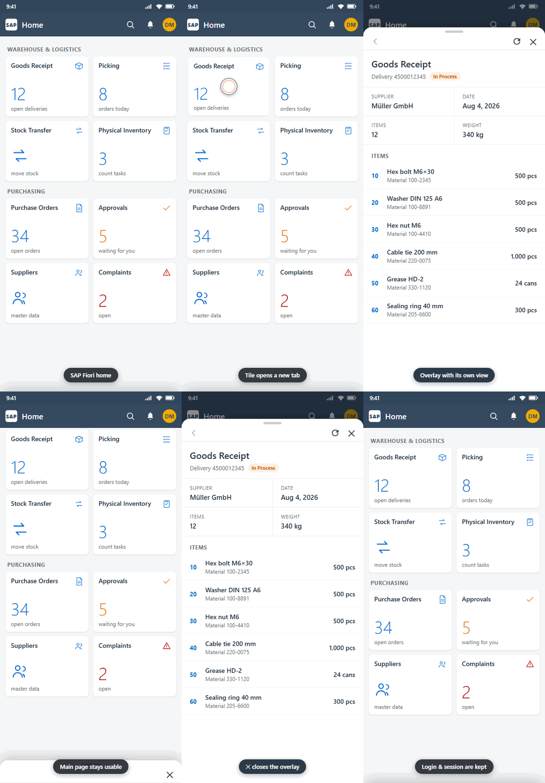
Handling
The panel has a slim header at the top:
| Element | Function |
|---|---|
| Back arrow (left) | Steps back inside the panel, page by page. The panel stays open. |
| Reload | Reloads the page inside the panel. |
| X (right) | Closes the panel entirely. |
The panel can also be parked without closing it: swipe it down by its handle or tap next to it. It then rests as a slim bar at the bottom edge of the screen. The previous page is immediately usable again; tapping the bar brings the panel back with its content unchanged.
What works in the panel exactly as on the main page
- The sign-in is shared. Cookies and session apply to both views – no need to log in again in the new panel.
- Scans land where you are working. While the panel is open, scans (intent scanners, backhand scanners, NFC cards, on-screen keyboards) go to the page inside the panel. Once it is parked as a bar, the main page receives the scans again.
- Login dialogs work. Username/password prompts and client certificates are requested and applied inside the panel too.
- Errors are shown properly. If a server cannot be reached or a certificate is invalid, the familiar TheFlex error page appears inside the panel – never a blank white window.
- The JavaScript interface is available. Custom scripts and the
flxfunctions work in the panel just like on the main page.
Settings
The feature is on by default. You will find the settings under Settings → User interface:
| Setting | Meaning |
|---|---|
| New tabs as overlay | Switches the feature on or off. Default: on. |
| Overlay control size | Size of the header, buttons and the parked bar: small, medium (default) or large. |
Note
If the feature is switched off, a link with target="_blank" or a window.open() loads the page in the same view – like a normal page change. The link never leads nowhere.
Configuration via device management (MDM)
Both settings can be distributed centrally:
| Key | Type | Values |
|---|---|---|
FlxOverlayTabsEnabled | bool | true (default) / false |
FlxOverlayTabSize | string | "S", "M" (default), "L" |
For details on MDM configuration see MDM Configuration - Intune and MDM Configuration - SOTI.